Desktop & smartphone interface
Service design
Lead UX
UI
2018 – 20
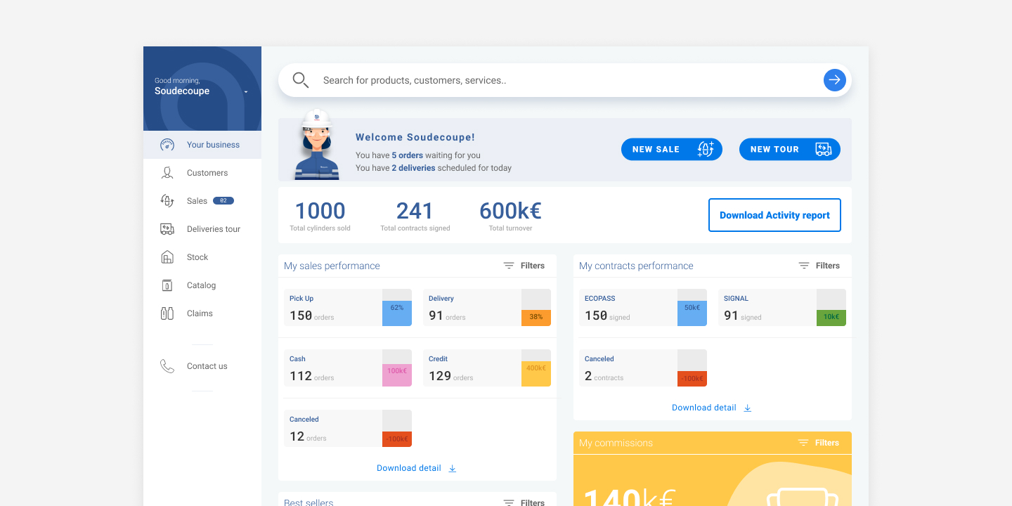
DI 2.0 Dashboard
Objective
Update, simplify and optimize the digital tool used by gas distributors to sell Air Liquide cylinders, services and equipments.
Context
MyGasPartner (MGP) is a reliable tool widely used in Europe (deployed in 11 countries , used by 5 000 distributors for 400 000 customers)
MGP mainly targets logistics and administrative functions
-
- Transaction: Gas, contract management, cylinder movement…
- Management of distributors’ deliveries
- Management of distributors’ inventory
- Stock visualisation & reordering
- Activity reports
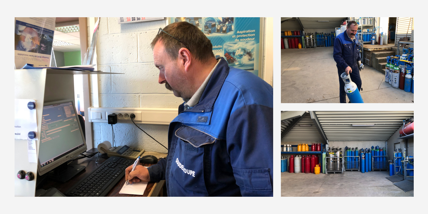
Daily professional day of a distributor
My role
At first, I analysed in detail the MGP tool documentation to identify all the existing features. I also had a look at the evolution roadmap of the tool.
Then, I went on the field in Belgium and France to meet several distributors and observe their daily professional life. I did a user shadowing and took notes. I also impersonated a distributor by realizing a gas order with the MGP tool. I participated to a delivery tour too.
From this observation and experimentation, I identified the main users’ pain points and created several experience maps.
Then, I proposed a first bench of high fidelity wireframes. On this base, I organized a sorting workshop with European countries managers to see how they projected themselves on the new information hierarchy I proposed.
From their feedback, I created an histogram to gather features and build the next iteration.
During several months, I co-leaded workshops to find a common agreement between distributors, business teams, project managers and designers on the main features of the future tool.
A first HTML mock-up came into life and I went back on the field to test it with pre-determined scenarios.
Following this user test I started a cycle of mock-ups iteration on Figma until the end of the project.
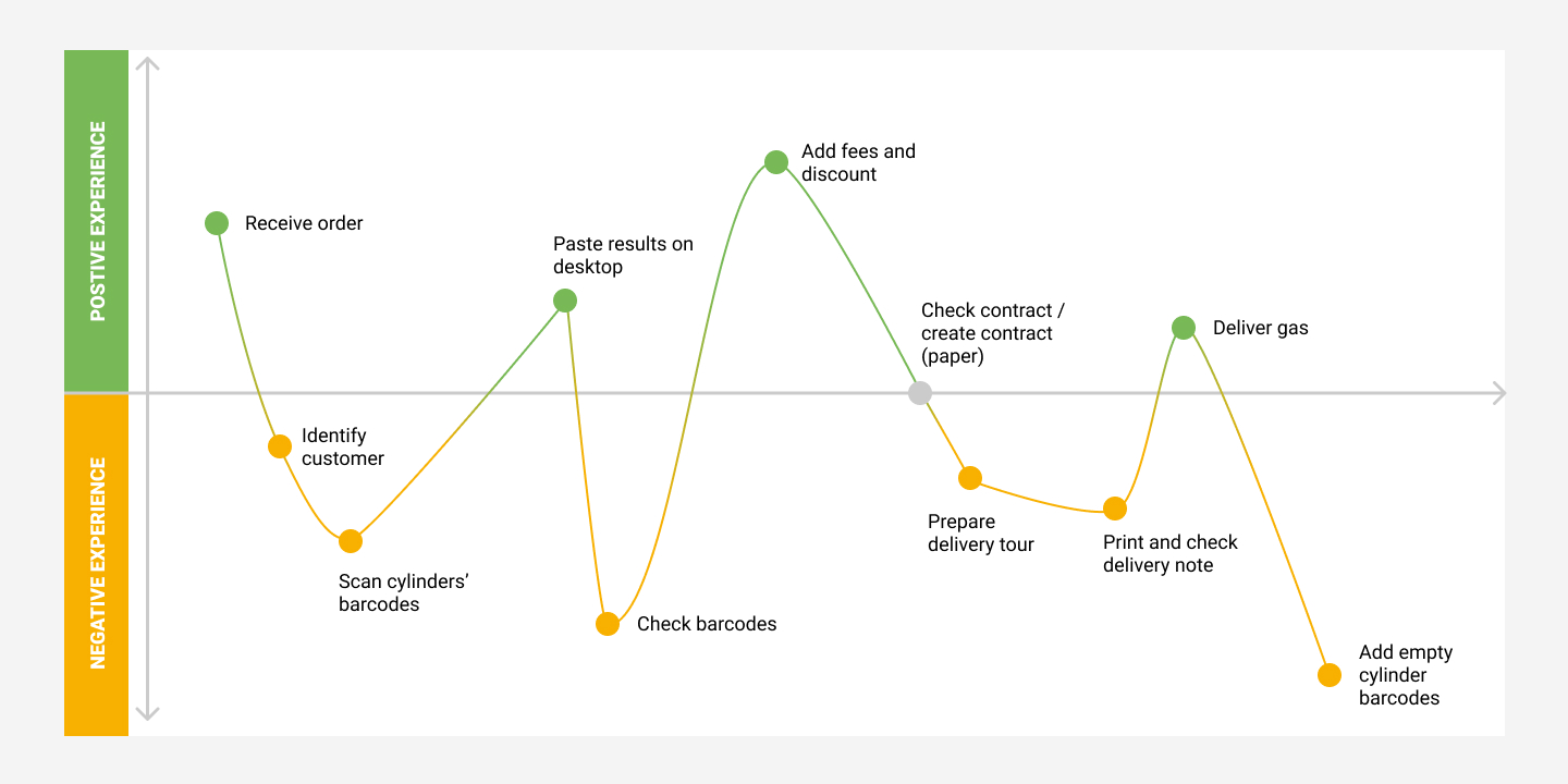
Experience map
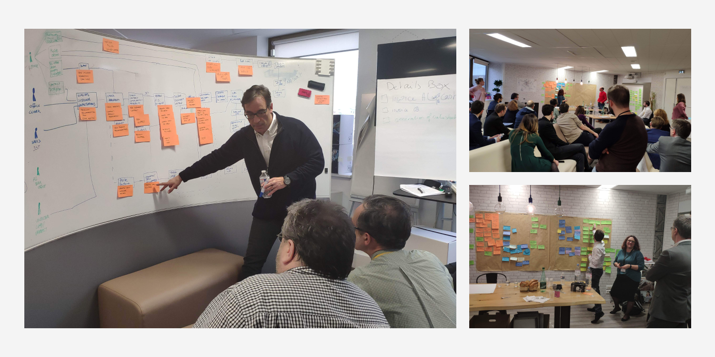
Workshops & meetings

Example of a user flow
The main pain points
One of the principal pain point for distributors was their way to manage products. In order to sell a full cylinder or to get back an empty one, they had to scan the cylinder’s barcode with a device which didn’t give any visual nor sound signal. Which, was very painful since they couldn’t check whether they had scanned correctly or not.
The second principal pain point was that the distributors had to check in a register to whom the scanned cylinders were belonging to, because the information wasn’t retrieved by the MGP tool.
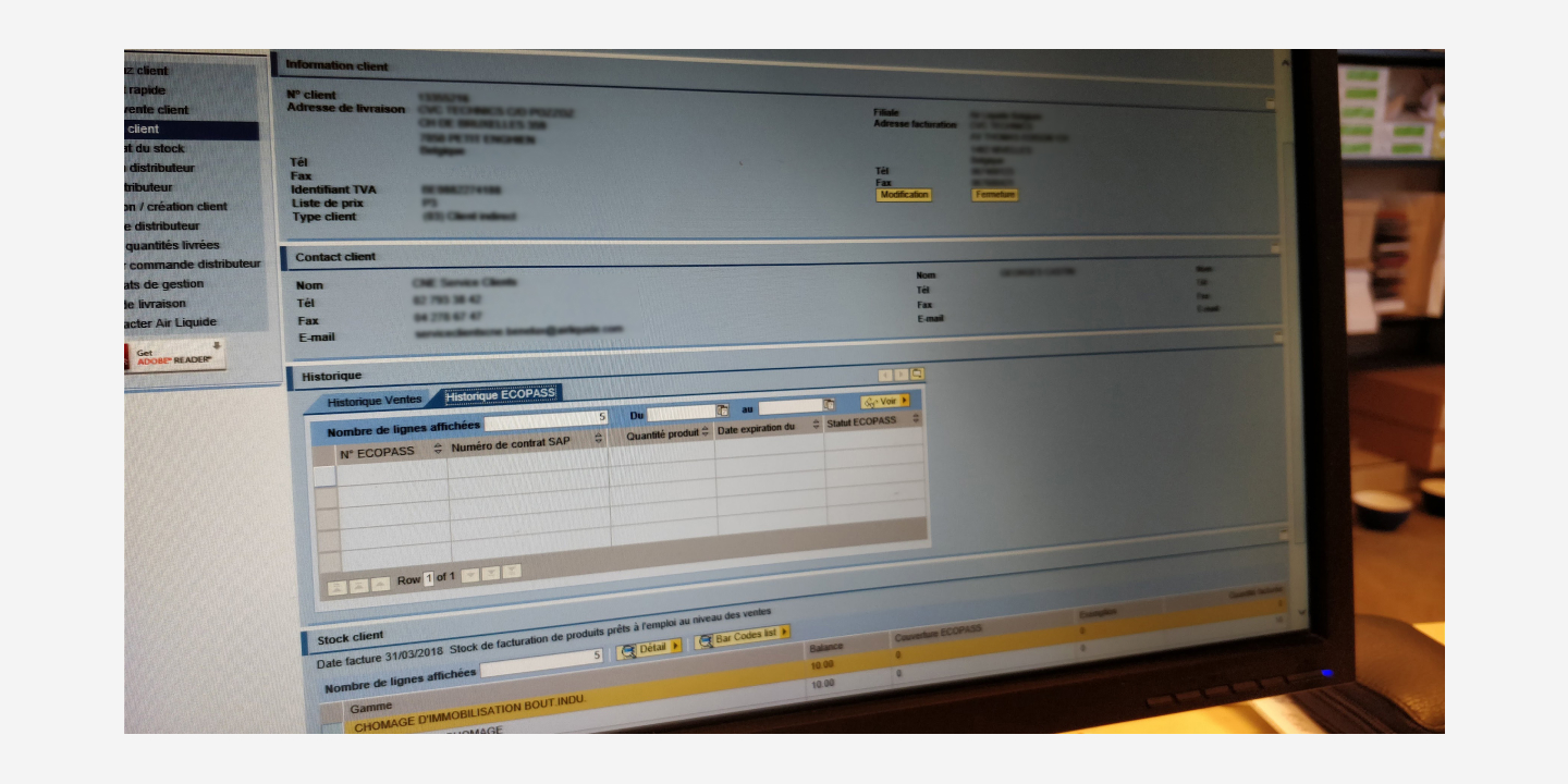
The third principal pain point was the complexity of the old MGP software. MGP was an SAP-looking tool, displaying a long list of fields to fill without any hierarchy. Moreover, many bugs were disturbing the distributors during their sale flow (disconnections, lack of error messages).
The distributions had to read a huge documentation to learn how to use the MGP tool.
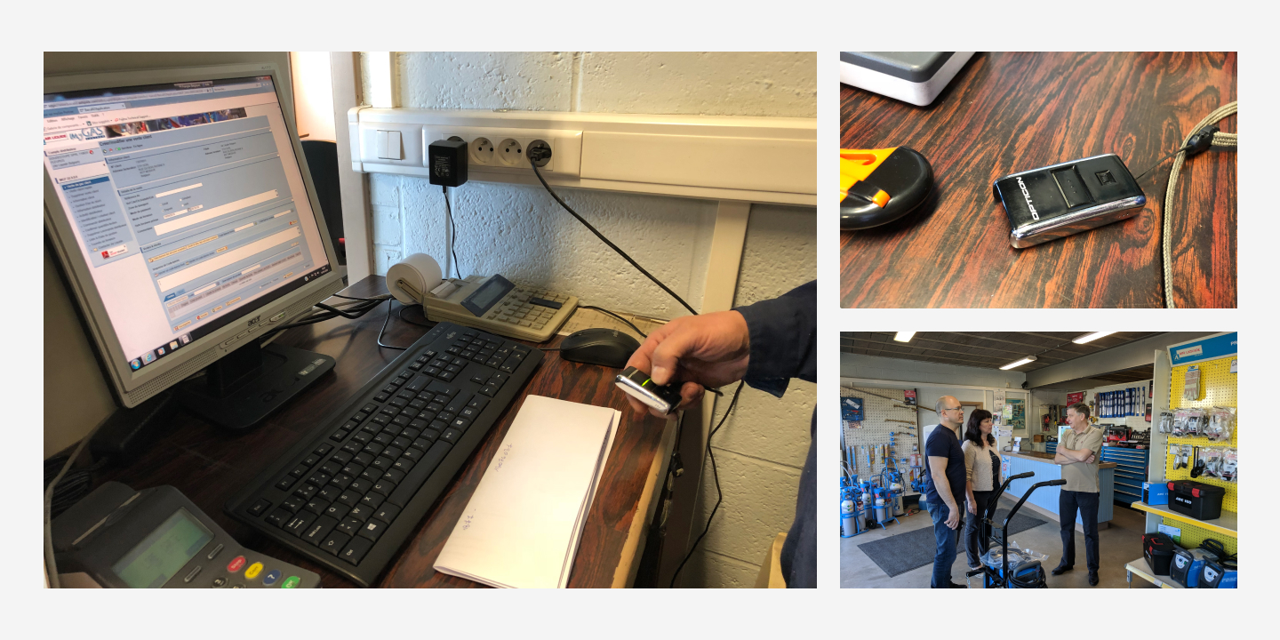
Old tool - MyGasPartner (MGP) : user research during a visit onsite
Stay agile with teams
To facilitate the coordination between designers, European countries managers, project managers and developers (Cap Gemini) all over the world, a SCRUM agile methodology was first implemented before switching to SAFe.
The design team was involved in every meeting:
- Kickoff meetings
- Weekly meetings
- UATs
- Business workshops
- Backlog reviews
- Product Increment plannings…
We designed following the Lean Design methodology, keeping in mind a user-centric approach.
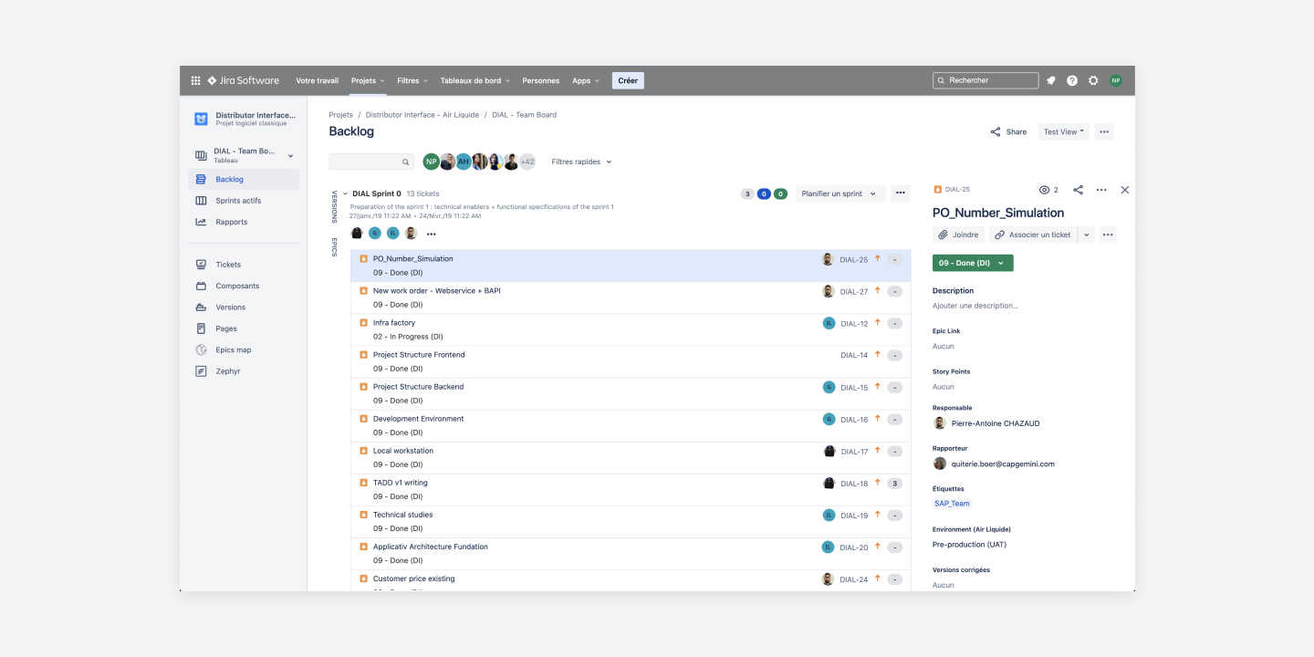
Jira's Backlog
Design an omnichannel saling tool
Air Liquide customers have several way to order gas. They can go to a distributor, phone to the telesales, or order online, by using an e-commerce website: myGAS. They can then either be delivered by Air Liquide or pick-up their order at the distributor’s store.
When an order is created by a customer in myGAS, the distributor must receive a notification with the products which must be delivered. The distributor must also be able to retrieve the same information the customers have access to by connecting in their personal space in myGAS.
Initially, I was also asked to stay close to the myGAS UI to have a fully omnichannel approach.
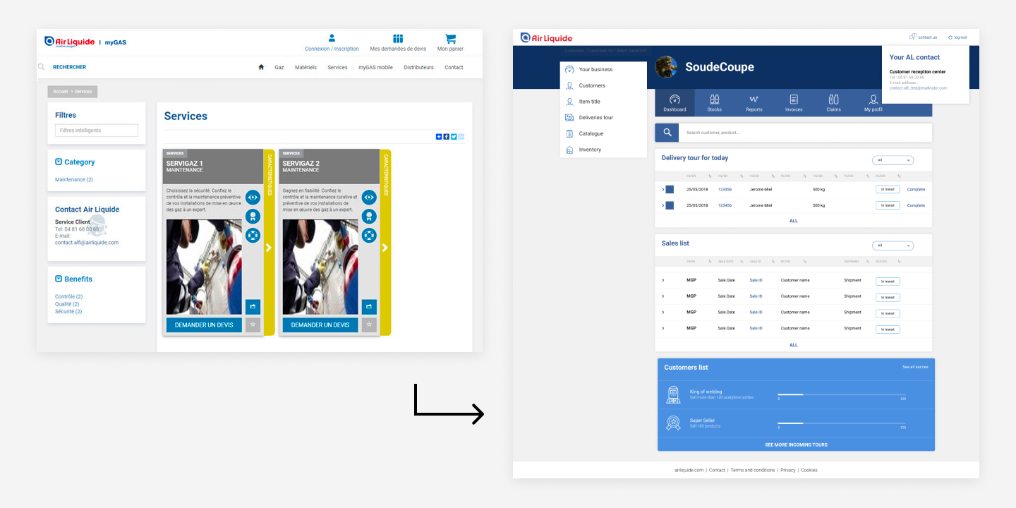
Left: myGAS - Right: first design approach
Responsive design & PWA
After several interface tests, I managed to convince the teams to break away from myGAS design and to create a new ergonomic, modern and responsive base, on which myGAS could capitalize.
To address the first pain point identified (see above) I decided to push the idea of developing a mobile application to help distributors scanning more easily the cylinders’ barcodes.
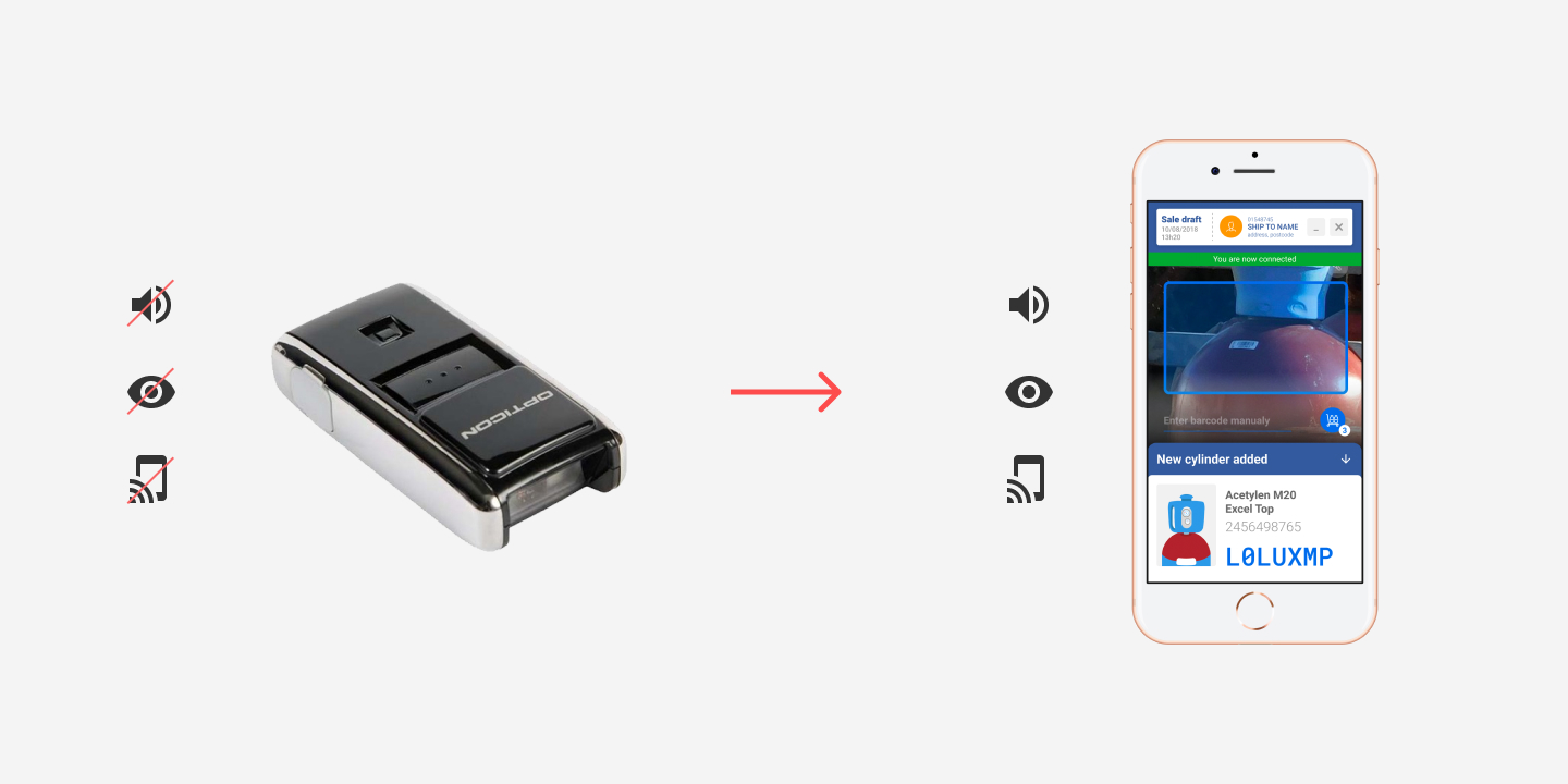
Old scanner - New DI 2.0 PWA
Atomic design
In parallel with this project, I worked with the design teams to develop the Air Liquide design system. The DI 2.0 project was a test of our atomic design
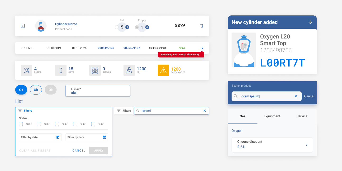
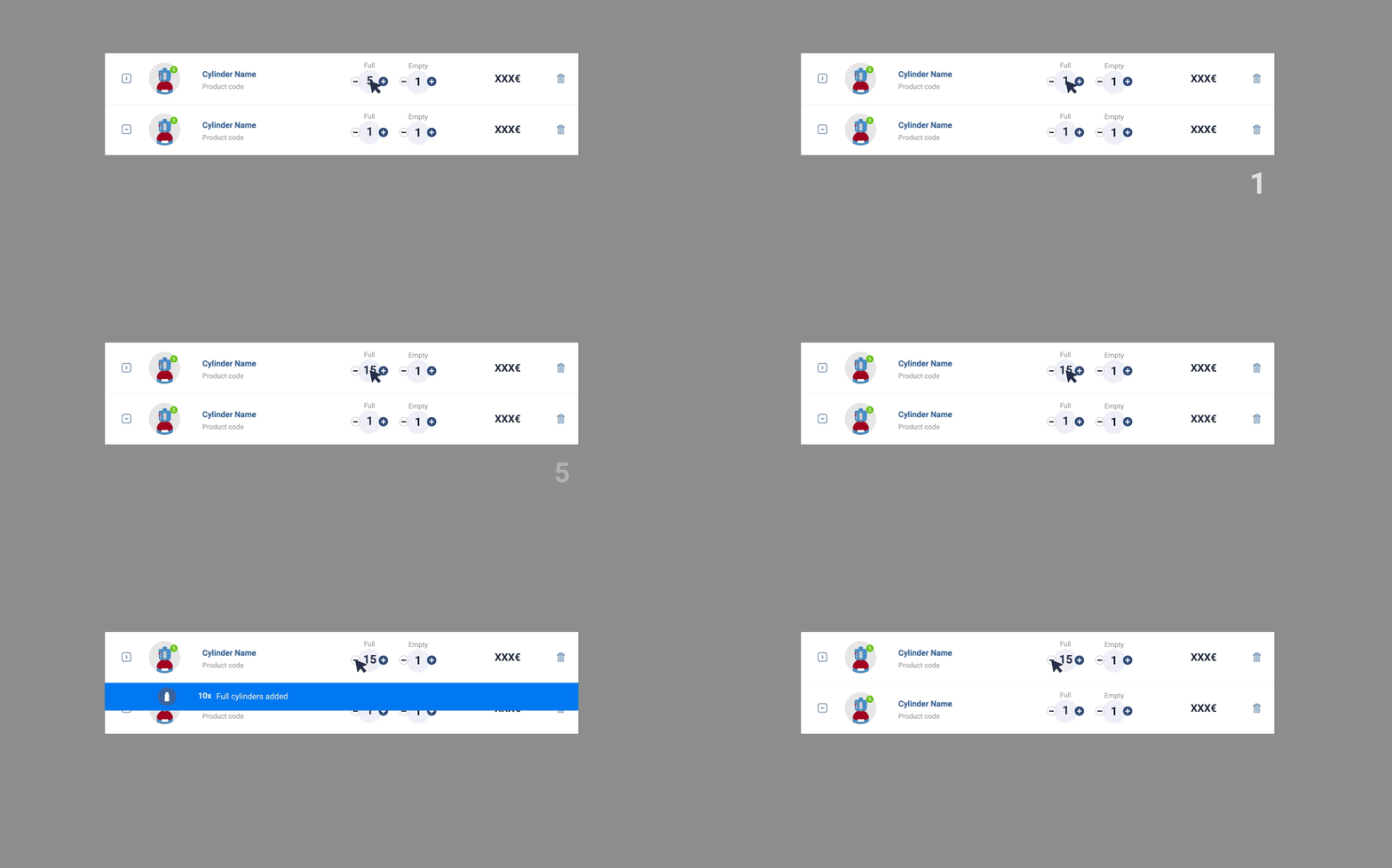
Atomic design based on Air Liquide's design system
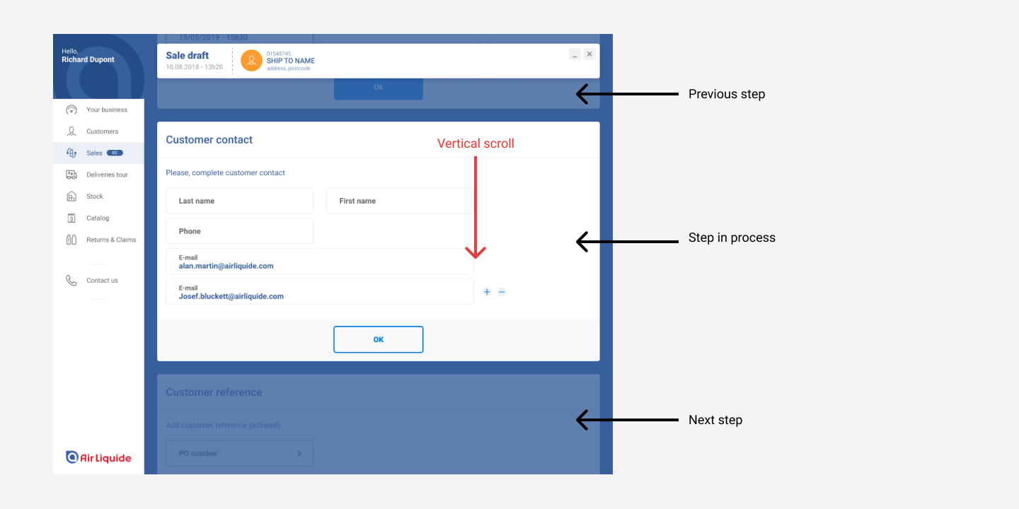
Improve the sales process
The process to make a sale is complex. The system needs to check many information to identify whether the sale can be validated or not.
We identified 5 mains steps to make a sale:
- Cylinders’s barcode validation
- Customer identification
- Sales parameters: date of delivery / discount / fees …
- Contract validation / creation
- Delivery note edition
To make these steps simpler, clearer and more intuitive, we have designed a stepper that separates all of the tasks that distributors must do throughout the sales flow.
