Expertise
Ux design
Ui design
Platforms
Sketch
Delivrables
Wireframes
Mockups
User tests
Website
Intranet only
Understanding the User and the Business Context
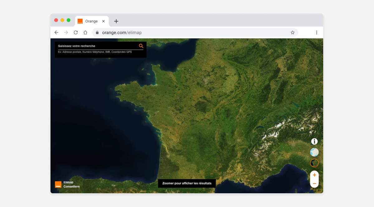
In the telecommunication industry, effective client consultation is paramount. At Orange, technical advisors must provide accurate and up-to-date information on household connectivity, particularly concerning fiber optic deployment. Historically, this task relied on two separate, outdated tools, which lacked synergy and intuition. These slow, disconnected systems made diagnostics a laborious process, hindering smooth customer service and increasing the risk of errors.
The goal of this project was to design a unified, modern tool capable of centralizing critical information and empowering technicians to make informed decisions. By anticipating the adoption challenges inherent in any major tool change, our approach focused on a user-centered methodology from the very beginning.
The Design Process: From Research to Solution
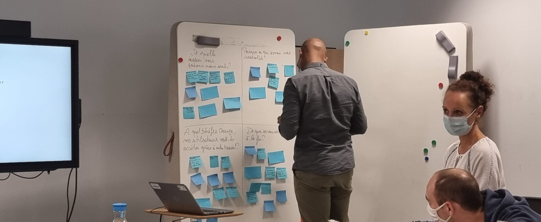
Our process began with an in-depth research phase. We conducted interviews with end-users, the Orange technicians, to understand their daily tasks, and specific needs. We also analyzed existing workflows to identify major pain points. This feedback was crucial for defining the key features of the new tool.
Key Features of the Tool
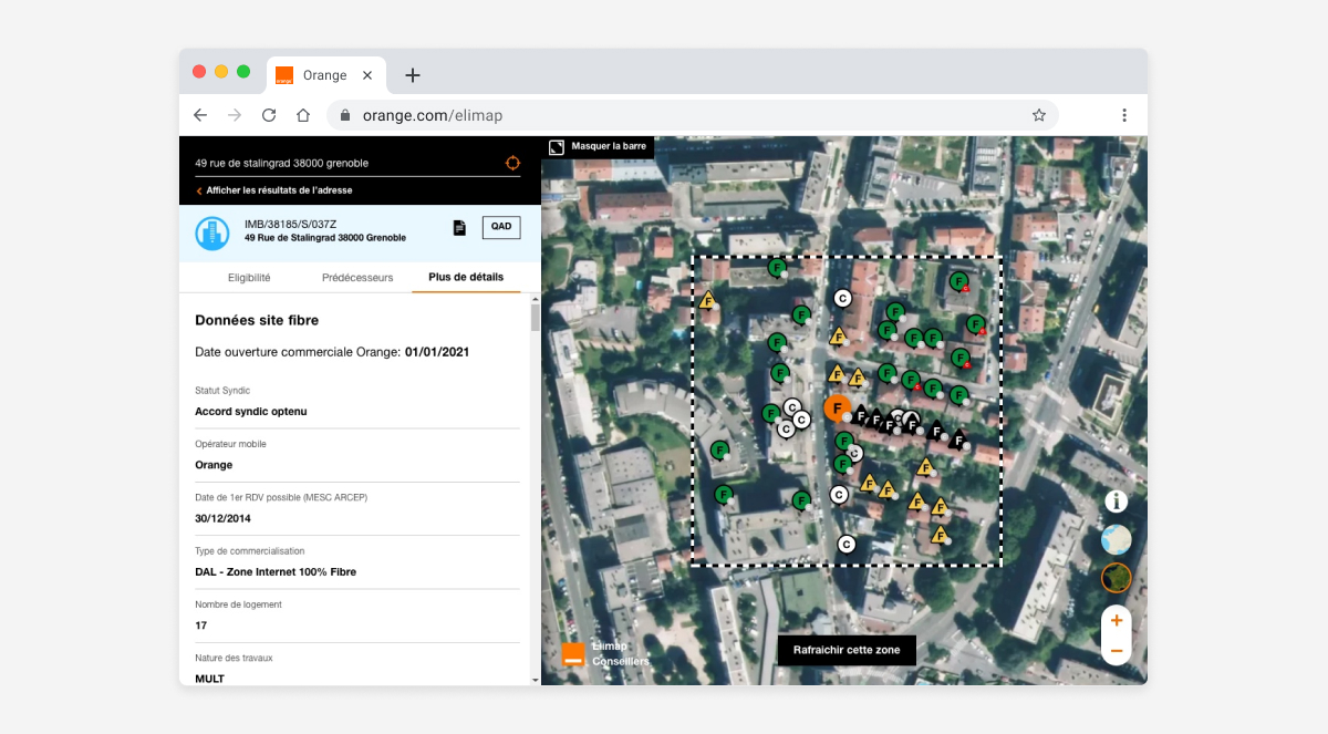
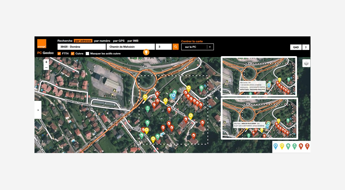
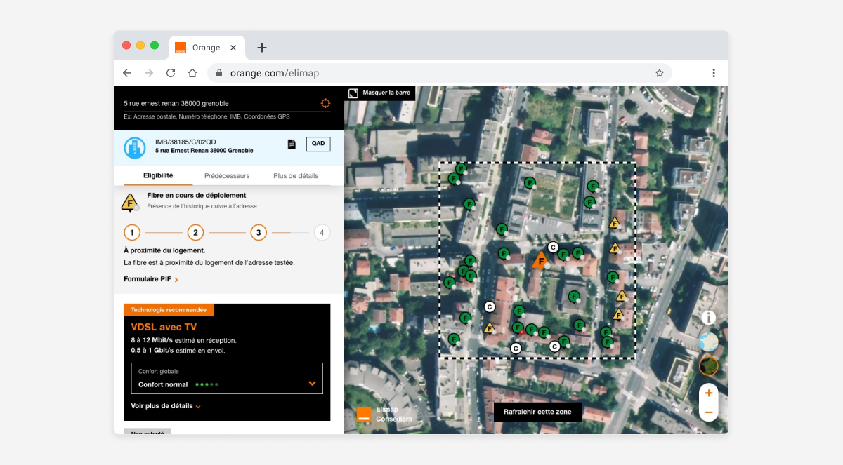
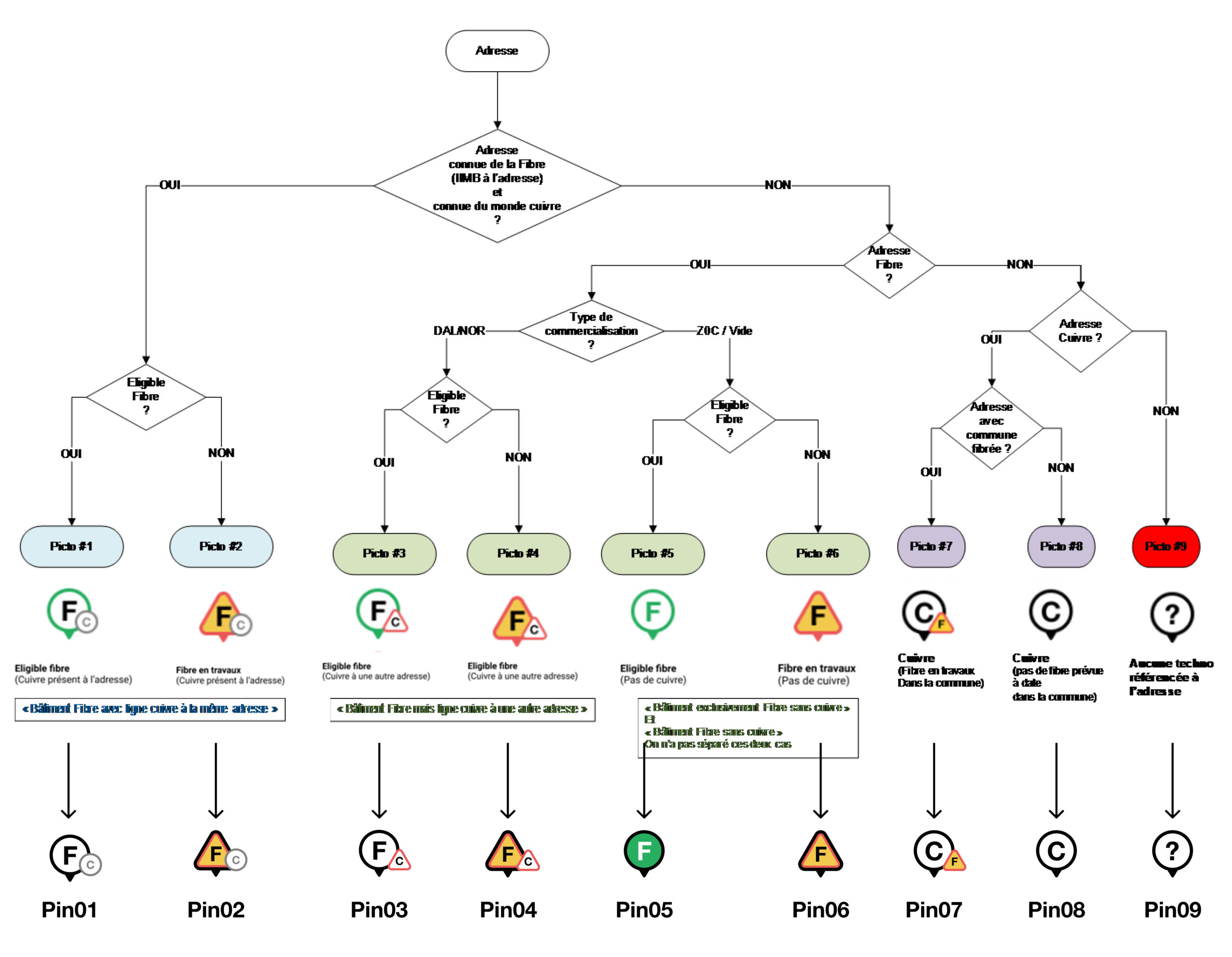
- Interactive Fiber Deployment Map: As the core of the application, this map allows advisors to visualize the real-time status of fiber deployment for a given area. For clarity, we developed an intuitive icon system to categorize different scenarios (e.g., « fiber deployment in progress, ADSL available, » « fiber deployed, ADSL available, » « no existing line, » « fiber awaiting deployment, » etc.). This allows technicians to grasp the information at a glance.
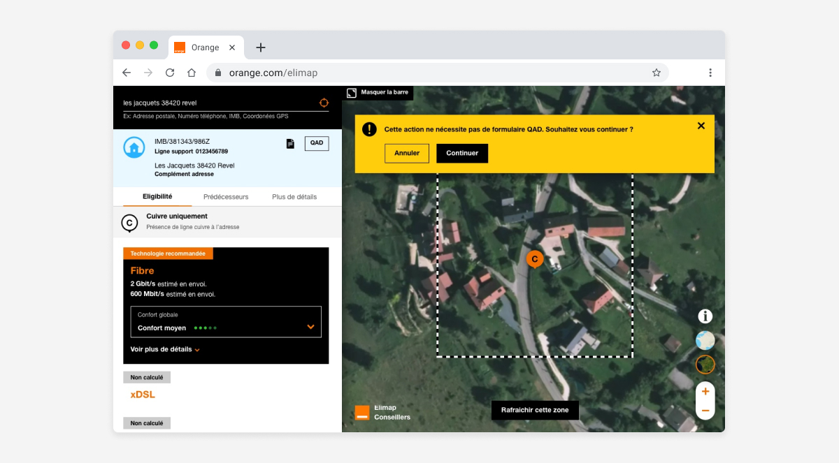
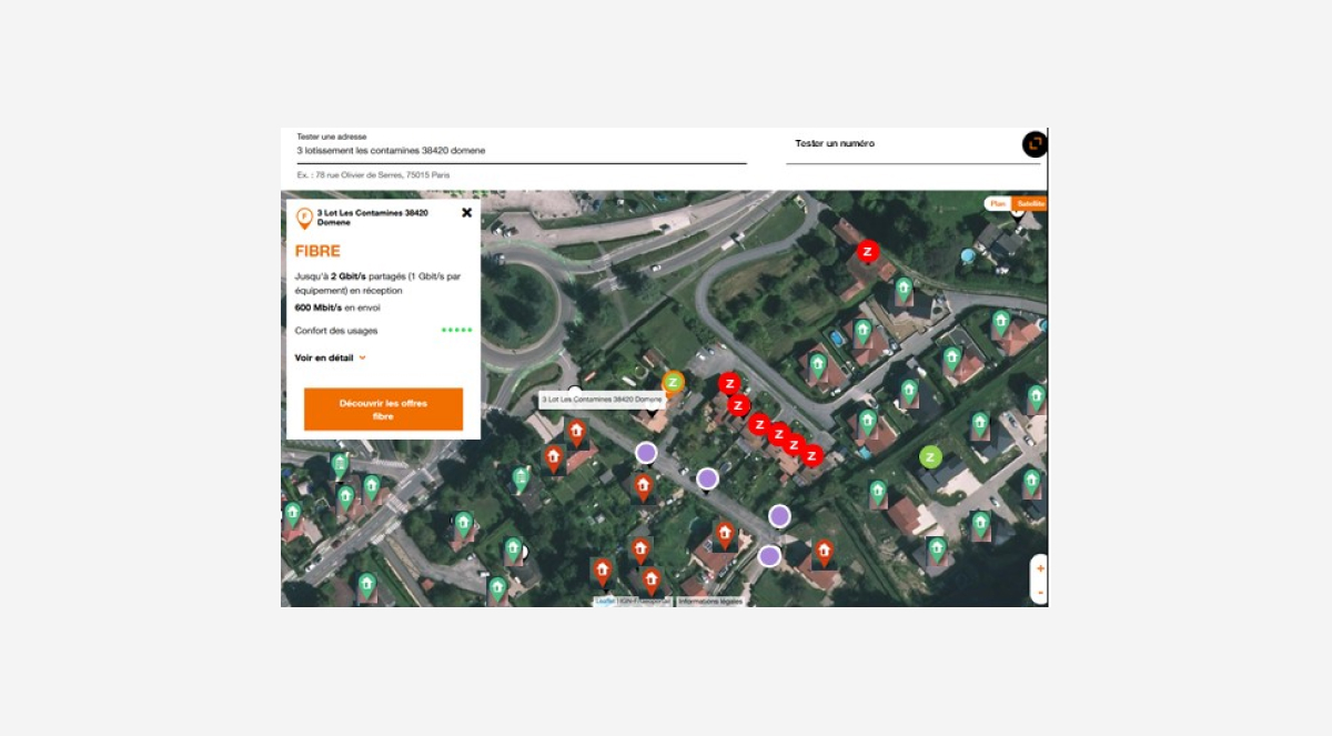
- Optimal Data Consumption Assessment: To facilitate client advice, the tool offers a line potential assessment. Based on the available technology (fiber, ADSL), it assigns a rating (e.g., 5 stars for streaming with fiber, 2 stars with ADSL), translating technical terms into a concrete indicator for the end customer.
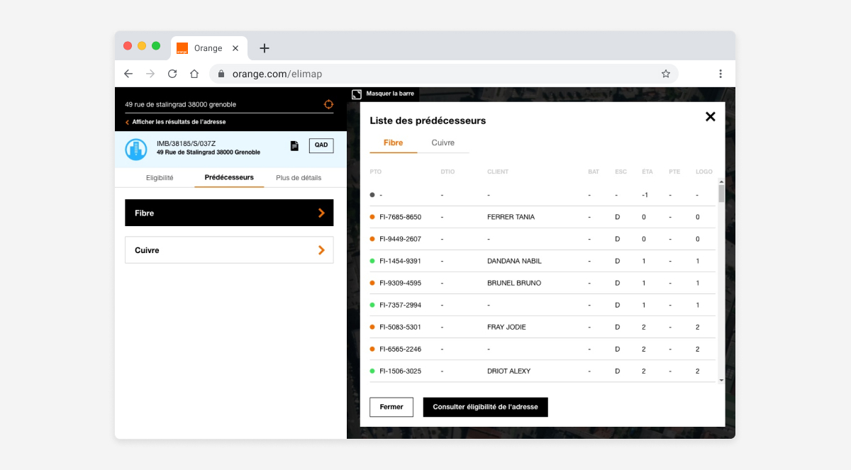
- History and Field Comments: The tool includes two essential tabs:
- Predecessor History: To view the history of past interventions on the line.
- Field Comments: A tab that displays feedback and notes left by technicians in the field. This promotes collaboration and provides more precise, human context.
The Icon System: Simplifying Complex Information
To make the deployment map immediately readable, we designed a unique and intuitive icon system. The challenge was to translate complex technical situations into clear, distinct visual symbols, even at a small scale. Each icon was designed to represent a specific deployment status:
- A specific icon for « fiber deployment in progress, ADSL available. »
- Another icon for « fiber deployed, ADSL available. »
- A distinct symbol for « no existing line. »
- A dedicated icon for « fiber awaiting deployment. »
These icons, tested during user workshops, allowed technicians to visually scan the map and understand the line’s status without having to read lengthy text. They became the visual language of the tool, speeding up diagnostics and decision-making.

From Prototypes to User Testing
To ensure our design met user needs, we first created mockups and interactive prototypes. These prototypes were then subjected to a series of user tests with technicians. This phase was essential for validating design choices, gathering constructive feedback, and refining the interface to make it more ergonomic. For example, we optimized navigation between tabs and fine-tuned the icon designs to ensure they were immediately understandable.