
All.com
Expertise
Ux design
Ui design
Platforms
Figma, Notion, Miro
Delivrables
Wireframes, User research, Prototypes, illustrations
Website
Project
The All.com website is the hotel reservation platform of the Accor group. It brings together famous hotel chains such as Raffles, Fairmont, Movenpick, Pullman, Sofitel, Mercure, and the Ibis range.
In a highly competitive online hotel reservation market, All.com aims to significantly increase direct traffic to its platform.
The All.com website is constantly evolving to keep up with the trends of its users, their needs, and the challenges of the hotel industry.
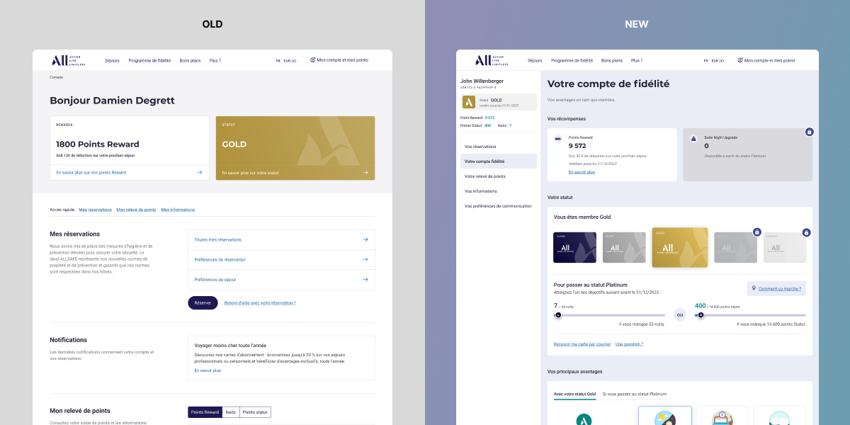
In this dynamic, the customer account had not evolved for some time. It was necessary to review all the functionalities, its ergonomics, and its user interface.
Process
I joined the team responsible for redesigning the customer account as a product designer (UX-UI). The team includes a Product Manager, a Product Owner, and an in-house development team. We operate in an Agile environment, and decisions are made with input from all project stakeholders, including design, development, and management.
To tackle this challenge successfully, we began by gathering as much data as possible on user behavior. We collected verbatims through tools like Google Analytics, Viavoo, and Content Square.
Involvement
Ux Design
Ui Design
User research
Illustrations
Client
Accor
Date
2022-2023
Credits
Clarisse Kelenberger – Product Owner
Mathilde Servia – Product Manager
Improve Customer Account
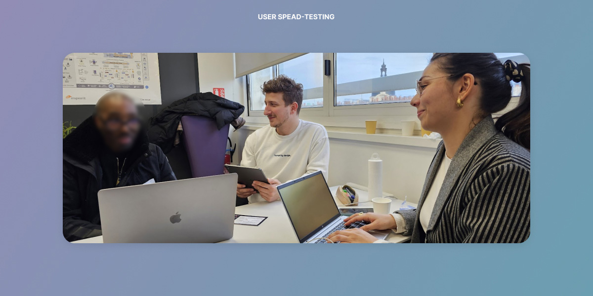
After numerous workshops, we iterated through several versions of the customer account. Once we reached something that was satisfying and aligned with user expectations, we organized « user speed testing » sessions to have our ideas and prototypes tested by target customers.
After several iterative steps, we decided to transform the customer account into a dashboard for the user. We have gather all the best practiced of our competitors and opted for a vertical navigation to better guide the user through the different sections of the account.
Business need
Improve customer satisfaction, provide more understanding about the loyalty program, make the loyalty points earning process more comprehensible, facilitate navigation, and enhance reservation details.
Goal
Create a new navigation, make the interface more intuitive, add educational elements about the loyalty program, introduce new features to enhance understanding of the loyalty program. The main goal is to make account information easy to use and understand for both new and existing users.
Personal challenge
The customer account had not undergone any major updates for several years. It was obsolete and did not allow users to take advantage of the offered benefits. It was necessary to create a new vision, centered around user needs and Accor’s new business challenges.
This project lasted for 13 months, divided into significant stages during which I defined the vision with key stakeholders and collaborated with the development team on various technical challenges, all while keeping the team motivated and inspired.
The most complex aspect during this revamping was to account for all possible use cases.
Results
Pending
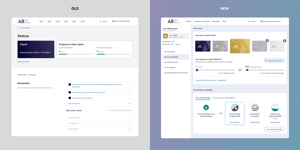
Loyalty section
Business need
Increase the number of individuals affiliated with the loyalty program, make the program understanding clearer, boost status progression, increase the use of reward points, and enhance customer satisfaction.
Goal
The All.com loyalty program is complex, and many of our users found it challenging to understand how to use it. The most significant effort was put into creating a simple and minimalist interface to make it more user-friendly. We added gamification to increase attractiveness of the program
Personal challenge
Enable users to visualize their point earnings more effectively, highlight progression within the loyalty program, emphasize the benefits associated with status. Provide a simple and intuitive experience that promotes understanding, attractiveness, and enthusiasm.
To achieve this, it was necessary to imagine and design new graphical components in line with the design system.
Results
Pending
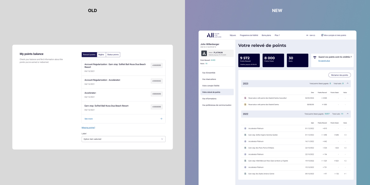
Points statement
Business need
Enhance visibility of customers’ point earnings. Reduce calls to the help center and improve understanding of the points system.
Goal
Previously, users struggled to understand the accumulation and expenditure of their status and reward points. Some stays that did not earn any points were not documented. We created an interface inspired by bank account and transactions history.
Personal challenge
To overcome this challenge, it was necessary to distinguish between different types of actions that result in point gains and those that do not. Technically, the development teams implemented a new solution that allowed us to obtain all the necessary data for accurate classification.
The final challenge was to make the timeline clear and intuitive, enabling users to easily access their history of earnings and expenditures.
Results
Pending
Reservations
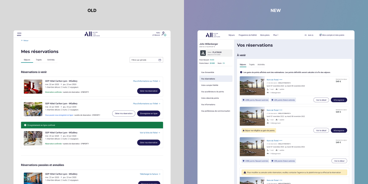
Business need
Inform users about the estimated point earnings for each reservation, enable invoice downloads, add the prices of stays, and allow online registration.
Goal
Improve ergonomics and incorporate information that is useful for customers in their daily activities.
Personal challenge
It is crucial for users to be able to visualize the number of points they earn during a reservation, so it was necessary to find a versatile system capable of displaying earnings as well as the ineligibility of certain bookings.
Visual representation plays a significant role in distinguishing one reservation from others. Striking a balance between textual information and visuals was one of the objectives to make this page more effective.
Results
Pending